COURTYARD XIAOYA - DA XIANG DESIGN STUDIO © Haha Lu, Wenchen Fang
The utilizing of light and the dark fun have been got the most here: there is no light source in the corridor and gray space, and the well is illuminated by the inner light source, where the light and shadow atmosphere created deliberately is like the veil of mystery. It gives people reverie, to enrich the entire space by motions. When the sky gets a bit dark, you can see the interior through the light and shadow on the glass, and see the opposite view through the rear window, which is mellow and interesting.

COURTYARD XIAOYA - DA XIANG DESIGN STUDIO © Haha Lu, Wenchen Fang

COURTYARD XIAOYA - DA XIANG DESIGN STUDIO © Haha Lu, Wenchen Fang

COURTYARD XIAOYA - DA XIANG DESIGN STUDIO © Haha Lu, Wenchen Fang

COURTYARD XIAOYA - DA XIANG DESIGN STUDIO © Haha Lu, Wenchen Fang
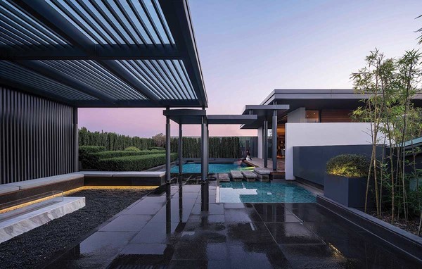
The transition of the city is a complicated process. Along with the old memories gradually gone, new emotions are constantly being generated. When production breaks through itself and has more connections with life, the vision of the garden will continue. The project is located in the Xucun Industrial Zone, Haining, Jiaxing, in which we built an elegant courtyard on the roof of a factory and named it as Xiaoya. In this courtyard, the functions of reception, catering, and office are combined. And it has broken through the single working mode and expanded the breadth and depth of life. How to deal with the relationship between architecture and environment has being the first research focus of the design. The place is adjacent to the main road of the city, and there are many self-built houses in the surrounding countryside. So the designer uses green plants as walls to shield from the noise on the road and disorder of vision, which has embodied the conception of oriental gardens by modern garden methods, and created an atmosphere of being in the city but like a wild place.

COURTYARD XIAOYA - DA XIANG DESIGN STUDIO © Haha Lu, Wenchen Fang

COURTYARD XIAOYA - DA XIANG DESIGN STUDIO © Haha Lu, Wenchen Fang
The interest of Xiaoya is circuitous moving. The way to arrive is not plain and unvarnished. The light changes suddenly through a very dark space from the office floor, and the stairwell becomes a huge space converter. Walk up the stairs, will pass by the hallway to the garden path. There're two floating screens which separate the space, leading a short journey has two sceneries. And after the turning, the space suddenly becomes extensive. The corridor design overlaps with the tourist line, which lead the free ramble mode become an opportunity for the interaction between people and the site. The delight of the stroll is the purpose of the landscape design. It is expected that people will walk barefoot. With the changes in texture and temperature of wood, stone, rock, and sand, they will touch the nerves of the footsteps, and tactile sense and vision will naturally link with the emotions, during which people will return to purity. In the eyes of Mies Van Der Rohe, barrier is no longer the antonym of the transparent, but creates one more space and one more possibility. His representative work, Barcelona Pavilion, uses multiple interspersed plates to create a flexible and changeable space, where the walls allow the sight to flow and the viewers' minds are active. It is truly "dazzling" and "make guest in happy emotion." "Insert a board in the sight"and you will find different sceneries from each side of the board.

COURTYARD XIAOYA - DA XIANG DESIGN STUDIO © Haha Lu, Wenchen Fang

COURTYARD XIAOYA - DA XIANG DESIGN STUDIO © Haha Lu, Wenchen Fang

COURTYARD XIAOYA - DA XIANG DESIGN STUDIO © Haha Lu, Wenchen Fang

COURTYARD XIAOYA - DA XIANG DESIGN STUDIO © Haha Lu, Wenchen Fang
The beauty of oriental gardens is that they can use rockery, bridges, ponds and other micro-landscapes and microecologies to imply the intention of yearning for rivers and the nature, which is called Die Shan Li Shui, and you can see the whole world from the a grain of sand. In Xiaoya, we seek armony and difference: intend to use the concept of oriental gardens to create a western garden landscape that incorporates geometric patterns, vegetation, architecture, and water features etc, which uses simple cubes to summarize the combination of the natural stones laying, cascade and the fold-up of the sceneries, which forms a unified visual element.

COURTYARD XIAOYA - DA XIANG DESIGN STUDIO © Haha Lu, Wenchen Fang

COURTYARD XIAOYA - DA XIANG DESIGN STUDIO © Haha Lu, Wenchen Fang

COURTYARD XIAOYA - DA XIANG DESIGN STUDIO © Haha Lu, Wenchen Fang
The squeezing and dislocation of the building creates a series of wonderful corner spaces. On the one hand, these spaces bring light into the interior, on the other hand, they are used as courtyards. Behind the "cloudy pine forest" painting that landed like a screen in the lobby was a small deer that came out of the probe, which became the most naughty and lively color, echoing the space theme of Xiaoya. In The Book of Songs·Xiaoya·Deer Bell, stirred up the feelings by deer bell and eating grass. It shows the way of hospitality and the mind to entertain the guests, by utilizing which the designer creates resonance between people and space. Shadow is one of the elements that make up a person's emotional image. The breath of people, light, and space changes quietly at different times. Part of the restaurant is topped by a grille. Noon is the best time for the light to slide down. Shadows lie down on the wall, which becomes a changing background picture when guests dine.
빛으로 공간을 풍부하게 만든, COURTYARD XIAOYA
- 정혜영 기자
- 2021-10-18 15:04:09
- 조회수 805
- 댓글 0
정혜영 기자
저작권자 ⓒ Deco Journal 무단전재 및 재배포 금지


0개의 댓글
댓글 정렬